Here are a heaps of snippets I commonly use to make unique websites for clients. They are generally placed in the Theme Options section, or in the child theme CSS file.
Superimpose logo
#top-header {z-index: 99999;}
#logo {
max-height: 220%;
margin-top: -32px;
z-index: 100000;
}
@media only screen and (max-width : 980px) {
#logo { margin-top: 0px}}
Add custom text to capcha box (in Divi contact form module)
.et_pb_contact_form_0.et_pb_contact_form_container .et_pb_contact_right p::before {content: "Check you are not a robot! ";}
Create transparent grey overlay on Maps module
.et_pb_map_container {

filter: url("data:image/svg+xml;utf8,#grayscale");

filter: grayscale(100%);

-moz-filter: grayscale(100%);

-ms-filter: grayscale(100%);

-o-filter: grayscale(100%);

filter: gray; /* IE6-9 */

-webkit-filter: grayscale(100%);

}
On posts, remove the name, date and category text/sub heading
.post-meta { display: none; }
Header menu – adding transparent background image to main menu
#main-header::after {

content: "";

background-image: url('https://IMAGE URL');

background-size:cover;

opacity: 0.5;

top: 0;

left: 0;

bottom: 0;

right: 0;

position: absolute;

z-index: -1;

}
Adding text shadow to menu text items
Note this only adds the shadow to links that are not the existing page. To Add shadow to the link of the current page you will need to also add CSS for .et_color_scheme_green #top-menu li.current-menu-ancestor > a and .et_color_scheme_green #top-menu li.current-menu-item > a
(this does allow you to have different CSS shadow color and opacity to the other menu items – which can very very useful as the header menu link and active/current page can be in contrasting colours which means the text shadow can look a bit off..).
#top-menu a {

color: #353535;

font-family: 'Oswald', sans-serif; /* of course change this to suit the

font-size: 22px;

font-weight: 700;

-webkit-font-smoothing: antialiased;

text-shadow: 0px 0px 4px rgba(255,255,255, 1);

}
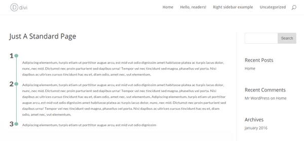
Add Connected Bullet Lists
I’m yet to find a way to do this to create a timeline, but if I find the code it will be certainly added here. If you do know how to created connected timeline please Contact Me!
.dots-list {
width: 100%;

}

.dots-list ol {
padding-left: 50px;
position: relative;
margin-bottom: 20px;
list-style: none !important;
}

.dots-list ol li {
position: relative;
margin-top: 0em;
margin-bottom: 20px;
}

.dots-list ol li .number_divider {
position: absolute;
left: -50px;
font-weight: 800;
font-size: 2em;
top: -5px;
}

.dots-list ol li:before {
content: "";
background: #8dbeb2;
position: absolute;
width: 2px;
top: 1px;
bottom: -21px;
left: -24px;
}

.dots-list ol li:after {
content: "";
background: #8dbeb2;
position: absolute;
width: 15px;
height: 15px;
border-radius: 100%;
top: 1px;
left: -31px;
}

.dots-list ol li:last-child:before {
content: "";
background: #ffffff;
}

Recent Comments